
Every service card carries a status badge — Deploying, Running, Failed, or Stopped — visible on the project canvas without opening anything. It's the fastest health check there is: a glance at the canvas tells you which of your services need attention.
Live CPU & Memory
Opening a service's Observability tab shows a "Right now" line — current CPU (in millicores, a thousandth of a vCPU) and memory — followed by two charts plotting the hourly average of each over time. These come straight from the cluster's own metrics, not an estimate.
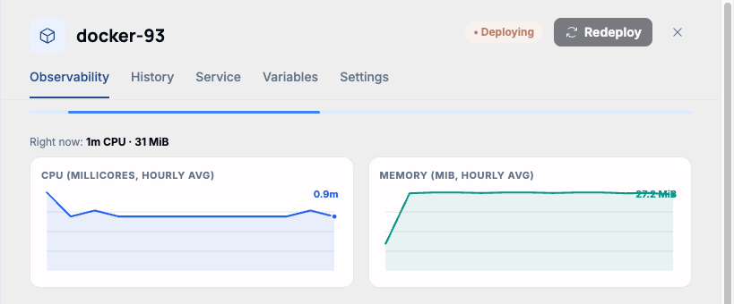
Note. These charts track the container itself, independent of the higher-level deploy pipeline. A service can report live CPU/Memory usage here even while its overall status is still "Deploying" — the container came up and is running code, even if the deploy hasn't been marked healthy yet.
When there's nothing to show
A brand-new deploy, or one that failed before its container ever started, shows "Runtime metrics will appear once the deployer agent reports them" instead of a chart. That's expected — there's nothing to measure yet, not a broken page.